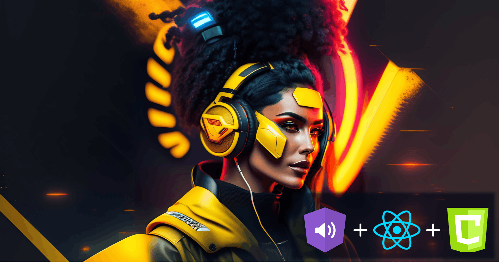
Creating a Cyberpunk-Themed Music Player with React, Web Audio API, and Canvas


Introduction
Music has always played a significant role in our lives, bringing comfort, inspiration, and motivation. Whether you're enjoying your favorite tracks or relaxing after a tiring day, music has the power to transport us to a different place and time.
As a front-end developer, I decided to put my skills and creativity to the test by bringing the beauty of music to life on the web. Combining my love for visualizations and cyberpunk aesthetics, I was inspired to create a music player that was both functional and aesthetically pleasing.
In this article, I'll take you on a journey of building a cyberpunk-themed music player using React, the Web Audio API, and Canvas. By the end of this article, you will have a solid understanding of how to:
Build a music player with standard features such as:
Play
Pause
Next
Previous
Shuffle
Repeat
Volume control
Integrate the Web Audio API into your projects to enhance your applications with audio.
Create simple animated visual sketches using Canvas by adding an audio visualizer to the music player.
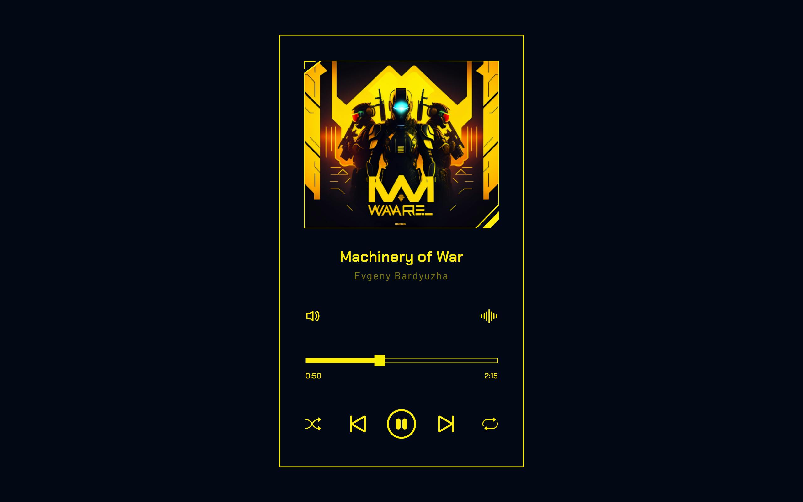
Here's a sneak peek at what we'll be building:
You can find the live demo of the music player here. The complete code for this project is also available on my GitHub here.
Prerequisites
Before we begin, kindly note that a basic knowledge of the following tools is required:
HTML
CSS
JavaScript
React v16.8+
Alright, with all that out of the way, let's begin!
Project Setup and Installation
Creating a new React project
Let's start by creating a new React project. To do this, run the following command in your terminal:
npm create vite@latest cyberpunk-music-player -- --template react
This will create a new React project in a folder named cyberpunk-music-player.
Installing required dependencies
The only new dependency needed for this project is react-bootstrap-icons. To install this library, navigate to the project directory and run the following command:
cd cyberpunk-music-player
npm install
npm i react-bootstrap-icons
We'll be using react-bootstrap-icons to incorporate icons into the UI of the project.
Setting the basis of the app
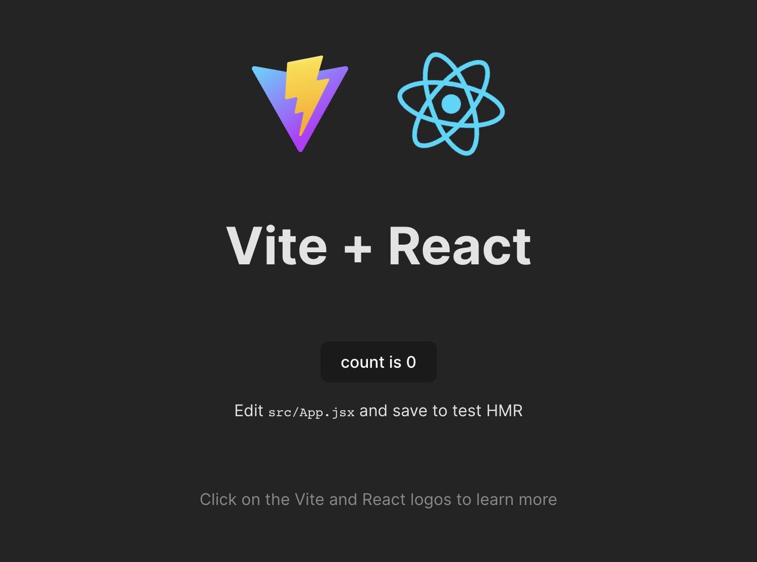
With the project setup and dependencies installed, it's time to configure the project structure. Navigate to the project directory and run the following command:
npm run dev
This starts our development server and lets us run our React app in real-time. We should have something similar to what we have below:
Next, let's delete all the files in the src directory, then create two new directories within the src folder:
components- This will store all our React componentsstyles- This is where we'll keep our application's CSS files.
Next, navigate to the src folder and create a new main.jsx file with the following code:
import React from "react";
import ReactDOM from "react-dom/client";
import "./index.css";
import App from "./App.jsx";

const root = ReactDOM.createRoot(document.getElementById("root"));
root.render(
    <React.StrictMode>
        <App />
    </React.StrictMode>
);
This sets up the entry point for our application and prepares our app for rendering.
Next, create a new App.jsx file and add the following code:
import React from "react";

const songs = [
    {
        id: 0,
        title: "Machinery of War",
        artist: "Evgeny Bardyuzha",
        image: "https://res.cloudinary.com/tropicolx/image/upload/v1675352152/music_app/machinery-of-war_fqu8z6.jpg",
        src: "https://res.cloudinary.com/tropicolx/video/upload/v1675218409/music_app/Evgeny_Bardyuzha_-_Machinery_of_War_fyaroh.mp3",
    },
    {
        id: 1,
        title: "Nova",
        artist: "2050",
        image: "https://res.cloudinary.com/tropicolx/image/upload/v1675351835/music_app/song-2_ljg2wd.jpg",
        src: "https://res.cloudinary.com/tropicolx/video/upload/v1675218406/music_app/2050_-_Nova_jp2ila.mp3",
    },
    {
        id: 2,
        title: "Medusa",
        artist: "Kryptos",
        image: "https://res.cloudinary.com/tropicolx/image/upload/v1675351585/music_app/song-3_ppgsaf.jpg",
        src: "https://res.cloudinary.com/tropicolx/video/upload/v1675218402/music_app/Kryptos_-_Medusa_yyj3nc.mp3",
    },
    {
        id: 3,
        title: "Artificial Intelligence",
        artist: "Lance Conrad",
        image: "https://res.cloudinary.com/tropicolx/image/upload/v1675351701/music_app/song-4_yaqewe.jpg",
        src: "https://res.cloudinary.com/tropicolx/video/upload/v1675218398/music_app/Lance_Conrad_-_Artificial_Intelligence_ioozhh.mp3",
    },
];

function App() {
    return (
        <></>
    )
}

export default App;
The App component returns an empty JSX Element for now, but soon it will be the driving force behind our music player. In the meantime, let's take a closer look at the songs constant. This constant holds all the information we need for each piece in our music player. As you can see, each object in the array represents a single song with its unique id, title, artist, image, and src (the source URL of the actual audio file).
The audio files themselves are hosted on Cloudinary. They were sourced from Artlist.io, a platform that provides tracks for creative projects. You can find and host the audio files with these platforms, but covering that process will complicate this guide. So, for now, we hard-coded the data in songs.
Before building the components, let's create an index.css file in the src folder for the global styles used throughout the app. Here is some code to get us started:
@import url("https://fonts.googleapis.com/css2?family=Bai+Jamjuree:wght@500&family=Barlow&family=Chakra+Petch:wght@600&display=swap");

* {
    margin: 0;
    padding: 0;
    box-sizing: border-box;
}

:root {
    --primary-color: #ffee08;
    --caption-color: rgba(255, 238, 8, 0.48);
    --background-color: #030816;
}

body {
    -webkit-font-smoothing: antialiased;
    -moz-osx-font-smoothing: grayscale;
}

button {
    position: relative;
    background: none;
    border: none;
    outline: none;
    cursor: pointer;
}

.app {
    background: var(--background-color);
    height: 100svh;
    display: flex;
    justify-content: center;
    align-items: flex-end;
}

.layout {
    max-width: 24.375rem;
    padding: 2.5rem 0;
}

@media only screen and (min-width: 768px) {
    .app {
        align-items: center;
    }

    .layout {
        border: 2px solid var(--primary-color);
        padding: 2.5rem;
    }
}

@media only screen and (max-height: 640px) {
    .app {
        align-items: center;
    }
}
This sets up a clean and stylish base for our music player app.
Building the User Interface
Let's take a moment to determine which components we want to split our application into. Breaking down the app into smaller pieces helps to keep our code organized and easy to maintain.

Here are the components we'll be building:
SongImage- This showcases the song's image. It also features an SVG frame that serves as a visual highlight for the image.Visualizer- This uses canvas to generate a cool visual representation of the music as it plays.SongDetails- This contains all the essential details about the song. This component includes:Song image (displayed through the
SongImagecomponent)Song title
Song artist
Song visualizer (provided by the
Visualizercomponent)
Volume- This is where users can adjust the volume of the music. It includes a volume button and a pop-up volume bar.ExtraControls- This is a container for theVolumecomponent and theVisualizertoggle button.Progress- This displays a progress bar representing the song's current play head position. The progress bar also doubles as a seeker, allowing the user to jump to any point in the music. This component also contains the song's elapsed time and total duration.PlayerControls- This houses the main controls for the music player. It consists of the following buttons:play- to play the songpause- to pause the songnext- to go to the next songprevious- to go to the previous songshuffle- to shuffle the songsrepeat- to repeat the song
With these components in mind, let's head to the components directory and build our components individually.
SongImage.jsx
// components/SongImage.jsx
import React, { useState, useEffect, useRef } from "react";

const SongImage = ({ url }) => {
    const [imageLoaded, setImageLoaded] = useState(false);
    const imageRef = useRef(null);

    useEffect(() => {
        setImageLoaded(false);
        if (!imageRef.current) return;
        imageRef.current.setAttribute("href", url);
        imageRef.current.onload = () => setImageLoaded(true);
    }, [imageRef, url]);

    return (
        <svg
            width="310"
            height="267"
            viewBox="0 0 310 267"
            fill="none"
            xmlns="http://www.w3.org/2000/svg"
            xmlnsXlink="http://www.w3.org/1999/xlink"
        >
            <g clipPath="url(#clip0_254_11)">
                <path
                    d="M273.651 266.399L309.429 229.84C309.795 229.466 310 228.964 310 228.441V2.34701C310 1.2434 309.106 0.348373 308.002 0.34701L27.6036 0.000835899C27.1645 0.000293745 26.7374 0.144299 26.3882 0.410626L0.787054 19.9381C0.291064 20.3164 0 20.9045 0 21.5283V265C0 266.105 0.895431 267 2 267H40.735H272.221C272.759 267 273.274 266.783 273.651 266.399Z"
                    fill="url(#pattern0)"
                    stroke="#FFEE08"
                    strokeWidth="2"
                />
                <line
                    x1="17"
                    y1="1"
                    x2="1"
                    y2="1"
                    stroke="#FFEE08"
                    strokeWidth="2"
                    strokeLinecap="square"
                />
                <line
                    x1="0.285156"
                    y1="12"
                    x2="0.285157"
                    y2="1"
                    stroke="#FFEE08"
                    strokeWidth="2"
                    strokeLinecap="square"
                />
                <path
                    d="M295.817 266.915C295.655 267.079 295.441 267.182 295.211 267.206L284.743 268.315C283.813 268.413 283.269 267.296 283.92 266.624L309.712 240.013C310.363 239.341 311.498 239.851 311.427 240.784L310.603 251.633C310.585 251.87 310.484 252.092 310.317 252.261L295.817 266.915Z"
                    fill="#FFEE08"
                />
            </g>
            <defs>
                <pattern
                    id="pattern0"
                    patternContentUnits="objectBoundingBox"
                    width="1"
                    height="1"
                >
                    <use
                        xlinkHref={
                            imageLoaded ? "#image0_254_11" : "#image0_254_12"
                        }
                        transform="matrix(0.000390625 0 0 0.000453535 0 -0.0805243)"
                    />
                </pattern>
                <clipPath id="clip0_254_11">
                    <rect width="310" height="267" fill="white" />
                </clipPath>
                <image
                    id="image0_254_11"
                    width="2560"
                    height="2560"
                    ref={imageRef}
                    opacity={imageLoaded ? "1" : "0"}
                    className="songDetails__image"
                    attributeName="song image"
                />
                <image
                    id="image0_254_12"
                    width="2560"
                    height="2560"
                    xlinkHref="https://res.cloudinary.com/tropicolx/image/upload/v1675211310/music_app/default-song-image_tmekey.svg"
                    attributeName="default song image"
                />
            </defs>
        </svg>
    );
};

export default SongImage;
This component takes the song image url as its prop and displays it as an SVG image element. The useRef hook is used to store a reference to the song image.
The component also defines a second image element used as a placeholder. The two image Elements are switched based on the loading status of the song image. The useState and useEffect hooks manage the song image's loading state.
The SVG elements around the images act as a frame to add flair to the song image.
Okay, now we have our SongImage component ready, let's move on to the next piece.
SongDetails.jsx
// components/SongDetails.jsx
import React from "react";
import SongImage from "./SongImage";
import "../styles/SongDetails.css";

const SongDetails = ({ song }) => {
    return (
        <div className="songDetails">
            <div className="songDetails__imageContainer">
                <SongImage url={song.image} />
            </div>
            <div className="songDetails__info">
                <h3 className="songDetails__songName">{song.title}</h3>
                <h4 className="songDetails__artistName">{song.artist}</h4>
            </div>
        </div>
    );
};

export default SongDetails;
The SongDetails component uses a song prop to render the song title, song artist, and SongImage we created earlier. The rendered contents are then wrapped in div elements with appropriate class names for styling purposes.
Next, let's head to the styles folder and create a new file named SongDetails.css. Add the following CSS code:
.songDetails,
.songDetails__info {
    display: flex;
    flex-direction: column;
    align-items: center;
}

.songDetails__info {
    user-select: none;
    -webkit-user-select: none;
    -moz-user-select: none;
    margin-top: 1.625rem;
}

.songDetails__image {
    transition: opacity 0.25s ease-in;
}

.songDetails__artistName,
.songDetails__songName {
    text-align: center;
}

.songDetails__songName {
    font-family: "Chakra Petch";
    font-weight: 600;
    font-size: 1.5rem;
    line-height: 1.9375rem;
    color: var(--primary-color);
}

.songDetails__artistName {
    margin-top: 0.375rem;
    font-family: "Barlow";
    font-weight: 400;
    font-size: 1rem;
    line-height: 1rem;
    letter-spacing: 0.1em;
    color: var(--caption-color);
}
This styles the layout and appearance of the SongDetails and SongImage components.
Volume.jsx
// components/Volume.jsx
import React, { useEffect, useRef, useState } from "react";

import "../styles/Volume.css";

const useOnClickOutside = (ref, handler) => {
    useEffect(() => {
        const listener = (event) => {
            if (!ref.current || ref.current.contains(event.target)) {
                return;
            }
            handler(event);
        };

        document.addEventListener("mousedown", listener);
        document.addEventListener("touchstart", listener);

        return () => {
            document.removeEventListener("mousedown", listener);
            document.removeEventListener("touchstart", listener);
        };
    }, [ref, handler]);
};

const Volume = ({ value, onChange }) => {
    const [isOpen, setIsOpen] = useState(false);

    const divRef = useRef(null);
    useOnClickOutside(divRef, () => setIsOpen(false));

    const toggleIsOpen = () => {
        setIsOpen((prev) => !prev);
    };

    const getVolumeSvg = (volume) => {
        if (volume === 0) {
            return (
                <svg
                    width={30}
                    height={30}
                    viewBox="0 0 30 29"
                    fill="none"
                    xmlns="http://www.w3.org/2000/svg"
                >
                    <path
                        d="M12.5985 6.09254C12.9233 6.24865 13.1299 6.57713 13.1299 6.93751V21.9375C13.1299 22.2979 12.9233 22.6264 12.5985 22.7825C12.2737 22.9386 11.8881 22.8947 11.6067 22.6696L7.17603 19.125H2.81738C2.29962 19.125 1.87988 18.7053 1.87988 18.1875V10.6875C1.87988 10.1697 2.29962 9.75001 2.81738 9.75001H7.17603L11.6067 6.20544C11.8881 5.98032 12.2737 5.93642 12.5985 6.09254ZM11.2549 8.88809L8.09053 11.4196C7.9243 11.5526 7.71776 11.625 7.50488 11.625H3.75488V17.25H7.50488C7.71776 17.25 7.9243 17.3225 8.09053 17.4554L11.2549 19.9869V8.88809Z"
                        fill="#FFEE08"
                    />
                </svg>
            );
        } else if (volume < 53) {
            return (
                <svg
                    width={30}
                    height={30}
                    viewBox="0 0 30 30"
                    fill="none"
                    xmlns="http://www.w3.org/2000/svg"
                >
                    <path
                        d="M13.1299 7.50001C13.1299 7.13963 12.9233 6.81115 12.5985 6.65504C12.2737 6.49892 11.8881 6.54282 11.6067 6.76794L7.17603 10.3125H2.81738C2.29962 10.3125 1.87988 10.7322 1.87988 11.25V18.75C1.87988 19.2678 2.29962 19.6875 2.81738 19.6875H7.17603L11.6067 23.2321C11.8881 23.4572 12.2737 23.5011 12.5985 23.345C12.9233 23.1889 13.1299 22.8604 13.1299 22.5V7.50001ZM8.09053 11.9821L11.2549 9.45059V20.5494L8.09053 18.0179C7.9243 17.885 7.71776 17.8125 7.50488 17.8125H3.75488V12.1875H7.50488C7.71776 12.1875 7.9243 12.1151 8.09053 11.9821Z"
                        fill="#FFEE08"
                    />
                    <path
                        d="M18.802 15C18.802 17.3299 17.8576 19.4393 16.3307 20.9662L15.0049 19.6403C16.1925 18.4528 16.927 16.8121 16.927 15C16.927 13.1878 16.1925 11.5471 15.0049 10.3596L16.3307 9.03374C17.8576 10.5606 18.802 12.67 18.802 15Z"
                        fill="#FFEE08"
                    />
                </svg>
            );
        }
        return (
            <svg
                xmlns="http://www.w3.org/2000/svg"
                width={30}
                height={30}
                fill="none"
            >
                <path
                    d="M21.629 26.27c2.884-2.884 4.668-6.869 4.668-11.27s-1.784-8.385-4.668-11.269l-1.326 1.326c2.545 2.545 4.119 6.06 4.119 9.944s-1.574 7.399-4.119 9.944l1.326 1.326z"
                    fill="#fff"
                    fillOpacity={0}
                />
                <path
                    d="M18.978 23.618A12.15 12.15 0 0 0 22.547 15a12.15 12.15 0 0 0-3.57-8.618l-1.326 1.326A10.28 10.28 0 0 1 20.672 15a10.28 10.28 0 0 1-3.021 7.292l1.326 1.326zM18.797 15a8.41 8.41 0 0 1-2.471 5.966L15 19.64A6.54 6.54 0 0 0 16.922 15 6.54 6.54 0 0 0 15 10.36l1.326-1.326A8.41 8.41 0 0 1 18.797 15zm-5.672-7.5a.94.94 0 0 0-1.523-.732l-4.431 3.545H2.813a.94.94 0 0 0-.937.938v7.5a.94.94 0 0 0 .938.938h4.359l4.431 3.545a.94.94 0 0 0 1.523-.732v-15zm-5.039 4.482L11.25 9.45v11.099l-3.164-2.531c-.166-.133-.373-.205-.586-.205H3.75v-5.625H7.5a.94.94 0 0 0 .586-.205z"
                    fill="#ffee08"
                />
            </svg>
        );
    };

    return (
        <div ref={divRef} className="volumeContainer">
            <button onClick={toggleIsOpen} tabIndex={0} aria-label="Volume">
                <div className="volume__icon">{getVolumeSvg(value)}</div>
            </button>
            {isOpen && (
                <div className="volume">
                    <div className="volume__sliderContainer">
                        <input
                            type="range"
                            aria-label="Volume slider"
                            value={value}
                            min="0"
                            max="100"
                            className="volume__slider"
                            onChange={onChange}
                        />
                        <svg
                            width={54}
                            height={150}
                            viewBox="0 0 54 150"
                            fill="none"
                            xmlns="http://www.w3.org/2000/svg"
                        >
                            <path
                                d="M5.09434 111H0.999996V149H53V1H12.6352L6.82795 6.69967L0.999996 12.8964V82H5.09434H6.09434V83V110V111H5.09434Z"
                                fill="#040C1F"
                                stroke="#FFEE08"
                                strokeWidth={2}
                            />
                        </svg>
                    </div>
                </div>
            )}
        </div>
    );
};

export default Volume;
First, we defined a custom hook useOnClickOutside, that listens for clicks outside an element and executes a handler function if the click did not occur within the element.
Next, we defined our component function. It accepts two props:
value- the current volume levelonChange- the function that changes the volume level when a user drags or clicks the volume slider
The component uses a useRef hook to store a reference to the volume container. The reference value is then passed to the onClickOutside hook, which closes the volume slider when a user clicks outside its container.
The component uses a useState hook to monitor the volume slider's open/closed state and a button to toggle it, with a volume icon that adjusts based on the value prop.
Now, let's style this component. Head over to the styles folder and create a Volume.css file. Add the following code:
 .volumeContainer {
    position: relative;
}

.volume {
    position: absolute;
    top: -10.375rem;
    left: -0.75rem;
}

.volume__sliderContainer {
    width: 3.375rem;
    height: 9.375rem;
}

.volume__icon {
    cursor: pointer;
    width: 1.875rem;
    height: 1.875rem;
}

.volume__iconBlocker {
    position: absolute;
    top: 0;
    left: 0;
    width: 1.875rem;
    height: 1.875rem;
    background-color: transparent;
    cursor: pointer;
}

.volume__slider {
    -webkit-appearance: none;
    appearance: none;
    transform: rotate(-90deg);
    position: absolute;
    top: 4.375rem;
    left: -2.5rem;
    background: transparent;
    border: 2px solid var(--primary-color);
    width: 8.5rem;
    height: 0.5rem;
}

.volume__slider:focus {
    outline: none;
}

.volume__slider:focus::-webkit-slider-thumb {
    outline: 2px solid var(--primary-color);
}

.volume__slider::-webkit-slider-thumb {
    -webkit-appearance: none;
    appearance: none;
    width: 1.0625rem;
    height: 1.6875rem;
    outline: 2px solid var(--primary-color);
    border-radius: 0.3125rem;
    background: #f8ef00;
    cursor: pointer;
    position: relative;
}
We made user-friendly adjustments for easy volume control, including a clickable icon, styled slider, and convenient positioning.
ExtraControls.jsx
// components/ExtraControls.jsx
import React from "react";

const ExtraControls = ({ children }) => {
    return <div className="extraControls">{children}</div>;
};

export default ExtraControls;
This will be the wrapper for the Volume component and the Visualizer toggle button.
Now, let's head over to the index.css file in the src directory and add the following code to style the component:
...
.layout {
    ...
}

.extraControls {
    margin-top: 2.625rem;
    display: flex;
    justify-content: space-between;
    align-items: center;
}

@media only screen and (min-width: 768px) {
    ...
}
...
We added some margin above the extra controls container to space it from the SongDetails component. We also added some styles to center the controls and display them at the edges of the container.
Progress.jsx
// components/Progress.jsx
import React from "react";

import "../styles/Progress.css";

const Progress = ({
    value,
    onChange,
    progressSeekStart,
    progressSeekEnd,
    timeElapsed,
    songLength,
}) => {
    return (
        <div className="progress">
            <input
                type="range"
                aria-label="Progress slider"
                value={value}
                min="0"
                max="100"
                className="progress__slider"
                onChange={onChange}
                style={{
                    background: `linear-gradient(90deg, var(--primary-color) ${Math.ceil(
                        value
                    )}%, transparent ${Math.ceil(value)}%)`,
                }}
                onTouchStart={progressSeekStart}
                onMouseDown={progressSeekStart}
                onTouchEnd={progressSeekEnd}
                onClick={progressSeekEnd}
            />
            <div className="progress__time">
                <span className="progress__timeElapsed">{timeElapsed}</span>
                <span className="progress__timeLength">{songLength}</span>
            </div>
        </div>
    );
};

export default Progress;
This component accepts the following props:
value- the song's current positiononChange- the function that is called when the progress bar is changedprogressSeekStart- the function called when the progress bar is touched or pressedprogressSeekEnd- the function called when the progress bar is released or clickedtimeElapsed- the time elapsed for the current songsongLength- the length of the current song
We returned a div that contains an input with a range type to display the progress slider. The value of this input is set to the value prop. We also set the minimum value to 0 and the maximum value to 100.
We gave the input some attributes set to either progressSeekStart or progressSeekEnd to control the user's interaction with the slider.
The background of the input is set to a linear gradient with the primary color on the left side and a transparent right side. The gradient is set to the value passed in from the props, with Math.ceil() used to ensure there is no decimal point.
Finally, we added a div inside the progress bar container to display the time elapsed and the song's length.
Next, let's go to the styles folder and create a Progress.css file. Add the following code:
.progress {
    margin-top: 2.625rem;
}

.progress__slider {
    -webkit-appearance: none;
    appearance: none;
    background: transparent;
    border: 2px solid rgba(255, 238, 8, 0.5);
    width: 100%;
    height: 0.5rem;
}

.progress__slider:focus {
    outline: none;
}

.progress__slider:focus::-webkit-slider-thumb {
    outline: 2px solid var(--primary-color);
}

.progress__slider::-webkit-slider-thumb {
    -webkit-appearance: none;
    appearance: none;
    width: 0.875rem;
    height: 0.875rem;
    outline: 2px solid var(--primary-color);
    background: #f8ef00;
    cursor: pointer;
    position: relative;
}

.progress__slider::-moz-range-thumb {
    width: 0.875rem;
    height: 0.875rem;
    outline: 2px solid var(--primary-color);
    background: #f8ef00;
    cursor: pointer;
    position: relative;
}

.progress__time {
    margin-top: 0.625rem;
    font-family: "Bai Jamjuree";
    font-weight: 500;
    font-size: 0.75rem;
    line-height: 0.9375rem;
    color: var(--primary-color);
    display: flex;
    justify-content: space-between;
    align-items: center;
    user-select: none;
    -webkit-user-select: none;
    -moz-user-select: none;
}
We customized the slider and improved the progress time styling for a cyberpunk theme. We also added a margin to separate the component and container.
PlayerControls.jsx
// components/PlayerControls.jsx
import React from "react";
import {
    PauseCircle,
    PlayCircle,
    Repeat,
    Repeat1,
    Shuffle,
    SkipEnd,
    SkipStart,
} from "react-bootstrap-icons";

import "../styles/PlayerControls.css";

const PlayerControls = ({
    isPlaying,
    toggleIsPlaying,
    prev,
    next,
    repeat,
    toggleRepeat,
    shuffle,
    toggleShuffle,
}) => {
    const centerControlSize = 47;
    const sideControlSize = 25;
    const color = "var(--primary-color)";

    return (
        <div className="playerControls">
            <button
                aria-label={shuffle ? "Disable shuffle" : "Enable shuffle"}
                className="shuffle"
                onClick={toggleShuffle}
            >
                <Shuffle color={color} size={sideControlSize} />
                {shuffle && <div className="dot" />}
            </button>
            <div className="playerControls__main">
                <button aria-label="Previous" onClick={prev}>
                    <SkipStart color={color} size={centerControlSize} />
                </button>
                <button
                    aria-label={isPlaying ? "Pause" : "Play"}
                    onClick={toggleIsPlaying}
                >
                    {!isPlaying && (
                        <PlayCircle color={color} size={centerControlSize} />
                    )}
                    {isPlaying && (
                        <PauseCircle color={color} size={centerControlSize} />
                    )}
                </button>
                <button aria-label="Next" onClick={next}>
                    <SkipEnd color={color} size={centerControlSize} />
                </button>
            </div>
            <button
                aria-label={repeat ? "Disable repeat" : "Enable repeat"}
                onClick={toggleRepeat}
            >
                {!repeat && <Repeat color={color} size={sideControlSize} />}
                {repeat && (
                    <>
                        <Repeat1 color={color} size={sideControlSize} />
                        <div className="dot" />
                    </>
                )}
            </button>
        </div>
    );
};

export default PlayerControls;
This component accepts the following props:
isPlaying- a boolean that indicates whether the song is currently playing or nottoggleIsPlaying- a callback function that toggles theisPlayingstate.prev- a function that plays the previous songnext- a function that plays the next songrepeat- a boolean that indicates whether repeat is enabled or nottoggleRepeat- a function that toggles therepeatstateshuffle- a boolean that indicates whether shuffle is enabled or nottoggleShuffle- a function that toggles theshufflestate
We created constants for the size and color of the button icons.
Next, we added the player control buttons and containers and the appropriate attributes to each button.
The button labels make the values assigned to each button attribute and their respective icons straightforward and intuitive.
The repeat and shuffle buttons contain a dot under their icons that will be shown only if their respective states are true.
Let's head over to the styles folder and create a PlayerControls.css file. Add the following code:
.playerControls {
    margin-top: 2.8125rem;
    display: flex;
    align-items: center;
    justify-content: space-between;
}

.playerControls__main {
    display: flex;
    align-items: center;
}

.playerControls__main > :not(:first-child) {
    margin-left: 1.4375rem;
}

.shuffle .dot {
    left: 0.5625rem;
}
These styles make a layout for the player control buttons and their icons.
Now, let's head over to our index.css file in the src directory and add the following styles for our dot elements:
...
.extraControls {
    ...
}

.dot {
    position: absolute;
    bottom: -2px;
    left: 0.675rem;
    width: 0.3125rem;
    height: 0.3125rem;
    border-radius: 50%;
    background-color: var(--primary-color);
}

@media only screen and (min-width: 768px) {
    ...
}
...
Visualizer.jsx
// components/Visualizer.jsx
import React from "react";

const Visualizer = () => {
    return <div id="canvasWrapper" />;
};

export default Visualizer;
This component returns a div with an id of canvasWrapper. We'll be using this wrapper to hold our canvas element that will be used to generate a visual representation of the music as it plays.
We're not configuring the actual visualizer functionality in this component just yet. We'll do that later in the article, using the canvas API to draw our visualizer onto a canvas element.
For now, let's add an outline for the canvas. Head to the index.css file and add the following code:
...
.dot {
    ...
}

#canvasWrapper canvas {
    outline: 2px solid var(--primary-color);
}

@media only screen and (min-width: 768px) {
    ...
}
...
Putting all the pieces together
So far, we've built all the main components for our app. Now it's time to put all our components together and integrate the logic of our music player.
The Web Audio API
Before diving into the code, let's take a moment to discuss the primary tool we'll be utilizing for audio - the Web Audio API.
The Web Audio API is a high-level JavaScript API for processing and synthesizing audio in web applications. It provides a simple and powerful way to add sound to web applications. It also offers various features, such as creating sound nodes, controlling volume, filtering, and even synthesizing sound from scratch.
With the Web Audio API, we can add audio to our application by simply creating an HTML audio element, a native HTML element for embedding audio into a page.
The Web Audio API also provides an AudioContext object. Think of AudioContext as a command center or a workshop where all the sound activities on a web page occur.
Now, within this 'workshop', there's a special tool called the AnalyserNode. It lets us take a closer look at the audio and pull out detailed information about it. Why is this useful? We want to create cool visual effects based on the beat or rhythm of whatever song is currently playing; the AnalyserNode helps us do just that by giving us the data we need for such visualizations.
Feel free to refer to the official documentation to learn more about the Web Audio API.
Creating the Audio Element
We've introduced the Web Audio API and discussed how it provides various features for controlling and manipulating audio. Let's dive into the code and integrate the audio element into our React app!
In the App.js file, add the following code:
import React, { useEffect, useRef, useState } from "react";

const songs = [
    ...
];

function App() {
    const audioRef = useRef();
    const [playlist, setPlaylist] = useState(songs);
    const [currentSongIndex, setCurrentSongIndex] = useState(0);
    const [progress, setProgress] = useState(0);
    const [dragging, setDragging] = useState(false);
    const [timeElapsed, setTimeElapsed] = useState(0);
    const [songLength, setSongLength] = useState(0);
    const [songFinished, setSongFinished] = useState(false);
    const [repeat, setRepeat] = useState(false);

    const setTimeUpdate = () => {
        const audio = audioRef.current;
        const currentTime = audio.currentTime;
        const progress = currentTime
            ? Number(((currentTime * 100) / audio.duration).toFixed(1))
            : 0;
        setTimeElapsed(currentTime);
        !dragging && setProgress(progress);
    };

    const setLoadedData = async () => {
        const audio = audioRef.current;
        setTimeElapsed(audio.currentTime);
        setSongLength(audio.duration);
    };

    useEffect(() => {
        if (songFinished) {
            if (!repeat) next();
            setSongFinished(false);
        }
    }, [songFinished]);

    return (
        <div className="app">
            <audio
                src={playlist[currentSongIndex].src}
                ref={audioRef}
                onTimeUpdate={setTimeUpdate}
                onLoadedData={setLoadedData}
                onEnded={() => setSongFinished(true)}
                loop={repeat}
                crossOrigin="anonymous"
            ></audio>
        </div>
    );
}

export default App;
We set up several states using useState to manage the current song, song progress, time elapsed, song length, repeat mode, and whether the song is finished. We then created a reference to the audio element using the useRef hook and assigned it to the audioRef variable.
Next, we set up some event listeners for the audio element using the onTimeUpdate, onLoadedData, and onEnded properties.
The setTimeUpdate function updates the time elapsed and song progress based on the current time of the audio. The setLoadedData function updates the song length when the audio data is loaded. The onEnded event handler sets the songFinished state to true when the audio has ended.
We used the useEffect hook to listen to the songFinished state. When the song is finished and the repeat mode is off, the next function (which we will define later) is called to play the next song.
Finally, we render the audio element with the properties defined in the code, including the source of the audio, the reference created with the useRef hook, and the event listeners.
Implementing the Structure and Main Functionalities
In this section, we'll implement the structure and main functionalities of the music player. Add the following code in the App.js file:
import React, { useEffect, useRef, useState } from "react";
import { Soundwave } from "react-bootstrap-icons";

import ExtraControls from "./components/ExtraControls";
import PlayerControls from "./components/PlayerControls";
import Progress from "./components/Progress";
import SongDetails from "./components/SongDetails";
import Volume from "./components/Volume";

const songs = [
    ...
];

function App() {
    ...
    return (
        <div className="app">
            ...
            <div className="layout">
                <SongDetails
                    song={playlist[currentSongIndex]}
                />
                <ExtraControls>
                    <Volume
                        value={volume * 100}
                        onChange={(e) =>
                            setVolume(Number(e.target.value) / 100)
                        }
                    />
                    <button
                        aria-label={
                            visualizer
                                ? "Disable visualizer"
                                : "Enable visualizer"
                        }
                        onClick={() => setVisualizer((prev) => !prev)}
                    >
                        <Soundwave color="var(--primary-color)" size={25} />
                        {visualizer && <div className="dot" />}
                    </button>
                </ExtraControls>
                <Progress
                    value={progress}
                    onChange={(e) => {
                        setProgress(Number(e.target.value));
                    }}
                    progressSeekStart={() => setDragging(true)}
                    progressSeekEnd={progressSeekEnd}
                    timeElapsed={formatTime(timeElapsed)}
                    songLength={formatTime(songLength)}
                />
                <PlayerControls
                    next={next}
                    prev={prev}
                    isPlaying={isPlaying}
                    toggleIsPlaying={() =>
                        setIsPlaying((isPlaying) => !isPlaying)
                    }
                    shuffle={shuffle}
                    toggleShuffle={() => setShuffle((shuffle) => !shuffle)}
                    repeat={repeat}
                    toggleRepeat={() => setRepeat((repeat) => !repeat)}
                />
            </div>
        </div>
    );
}

export default App;
This code implements the overall structure of the music player using the components we've already created. Note how we've added the Volume component and visualizer toggle-button within the ExtraControls component as intended.
Next, let's add the functionality to these components to make the music player work as expected:
...
function App() {
    ...
    const [isPlaying, setIsPlaying] = useState(false);
    const [volume, setVolume] = useState(0.7);
    const [visualizer, setVisualizer] = useState(false);
    const [shuffle, setShuffle] = useState(false);
    const [shuffledPlaylist, setShuffledPlaylist] = useState(songs);

    ...
    const setLoadedData = async () => {
        ...
    };

    const playSong = async () => {
        await analyser.context.resume();
        setIsPlaying(true);
        await audioRef.current.play();
    };

    const shufflePlaylist = () => {
        setShuffledPlaylist((playlist) => {
            if (playlist.length === 1) return playlist;

            const newPlaylist = playlist.filter(
                (song) => song.id !== playlist[currentSongIndex].id
            );

            let shuffledPlaylist = newPlaylist.sort(() => Math.random() - 0.5);

            shuffledPlaylist = [
                playlist[currentSongIndex],
                ...shuffledPlaylist,
            ];
            return shuffledPlaylist;
        });
    };

    const next = () => {
        const currentSongId = playlist[currentSongIndex].id;
        const newPlaylist = shuffle ? shuffledPlaylist : songs;
        setPlaylist(newPlaylist);
        setCurrentSongIndex(() => {
            const currentSongIndex = newPlaylist.findIndex(
                (song) => song.id === currentSongId
            );
            const nextIndex = currentSongIndex + 1;
            const newIndex = nextIndex > newPlaylist.length - 1 ? 0 : nextIndex;
            return newIndex;
        });
        playSong();
    };

    const prev = () => {
        const currentSongId = playlist[currentSongIndex].id;
        const newPlaylist = shuffle ? shuffledPlaylist : songs;
        setPlaylist(newPlaylist);
        setCurrentSongIndex(() => {
            const currentSongIndex = newPlaylist.findIndex(
                (song) => song.id === currentSongId
            );
            const prevIndex = currentSongIndex - 1;
            const newIndex = prevIndex < 0 ? newPlaylist.length - 1 : prevIndex;
            return newIndex;
        });
        playSong();
    };

    const updateCurrentTime = (value) => {
        const audio = audioRef.current;
        const currentTime = (value * audio.duration) / 100;
        audio.currentTime = currentTime;
    };

    const progressSeekEnd = (e) => {
        updateCurrentTime(e.target.value);
        setDragging(false);
    };

    const formatTime = (time) => {
        const minutes = Math.floor(time / 60);
        const seconds = Math.floor(time - minutes * 60);
        return `${minutes}:${seconds < 10 ? "0" + seconds : seconds}`;
    };

    useEffect(() => {
        audioRef.current.volume = volume;
    }, [volume]);

    useEffect(() => {
        const playOrPause = async () => {
            if (isPlaying) {
                await analyser?.context?.resume();
                await audioRef.current.play();
            } else {
                audioRef.current.pause();
            }
        };

        playOrPause();
    }, [isPlaying, analyser?.context]);

    useEffect(() => {
        if (shuffle) shufflePlaylist();
    }, [shuffle]);

    useEffect(() => {
        ...
    }, [songFinished]);

    return (
        ...
    );
}

export default App;
We created the useState variables for the remaining states we need in our music player. We also added a function shufflePlaylist that shuffles the songs in our playlist. It uses the setShuffledPlaylist function to update the state of the shuffled playlist. If the shuffle state is true, the function will sort the songs randomly in the playlist.
The next and prev functions perform the following actions:
Update the current playlist to either the
shuffledPlaylistor thesongsconstant depending on whether theshufflestate istrueorfalse.Use the
setCurrentSongIndexfunction to update the current song's index in the new playlist.Use the
playSongfunction to start playing the previous or next song.
The updateCurrentTime function updates the current time of the song being played. It takes in a progress value and uses that to calculate the current time of the song based on its duration. The progressSeekEnd function is used to seek a specific time in the song by updating the value of the current time.
The formatTime function is used to format the time of the current song into a string of minutes and seconds.
We also see the use of useEffect hooks, which are used to update the state of our music player in response to changes in its properties. For example, we used useEffect to update the volume of the song being played, control the play and pause functionality of the music player, and shuffle the playlist when the shuffle state was set to true.
Integrating the Visualizer
Configuring the Audio Analyser
In this section, we will create and configure an audio analyzer. We'll use this to analyze the audio in our application and use the data obtained to configure our Visualizer component.
Let's go to our App.js file and add the following code:
...
const songs = [
    ...
];

class AudioAnalyser {
    constructor(audioElement) {
        this.context = new (window.AudioContext || window.webkitAudioContext)();
        this.source = this.context.createMediaElementSource(audioElement);
        this.analyserNode = this.context.createAnalyser();
        this.source.connect(this.analyserNode);
        this.analyserNode.connect(this.context.destination);
    }
}

function App() {
    ...
    const [analyser, setAnalyser] = useState(null);
    ...
    const setTimeUpdate = () => {
        ...
    };

    const setLoadedData = async () => {
        const audio = audioRef.current;
        !analyser && setAnalyser(new AudioAnalyser(audio));
        setTimeElapsed(audio.currentTime);
        setSongLength(audio.duration);
    };

    const playSong = async () => {
        ...
    };
    ...
    return (
        <div className="app">
            ...
            <div className="layout">
               <SongDetails
                    visualizer={visualizer}
                    source={analyser?.source}
                    analyser={analyser?.analyserNode}
                    currentSongIndex={currentSongIndex}
                    song={playlist[currentSongIndex]}
                />
                ...
            </div>
        </div>
    )
}

export default App;
First, we defined the AudioAnalyser class. This class sets the foundation for processing and visualizing audio data from our audio element. When a new instance of AudioAnalyser is created, it expects an audioElement (like an HTML <audio> tag) to be passed to it. This element is the source of our music or sound.
Inside the constructor, we do the following:
Set up AudioContext: We're initializing
this.context. It's the main hub of the Web Audio API, an interface that lets us control, process, and analyze audio in the browser. We also account for potential browser compatibility issues by usingwindow.webkitAudioContextas a fallback.Creating Nodes: In the Web Audio API, "nodes" are building blocks that handle audio processing tasks. We initialize our first node
this.source, which represents the audio source in our audio processing graph. Next, we initializethis.analyserNode, allowing us to extract frequency and timing information from our audio source. This is crucial for our visualizer.Connecting Nodes: Here, we're defining the flow of our audio signal. First, we connect our audio source to the analyzer. Then, the analyzer connects to the audio context's destination (typically the device's speakers or headphones). This ensures that while we're analyzing the audio data, the audio also plays through the device's output.
Next, we modified the setLoadedData function to set the analyser to a new AudioAnalyser object if it is initially null, before setting the time elapsed and song length.
In the return statement of the App, we passed the analyser, source, and analyserNode properties of the AudioAnalyser object to the SongDetails component, which we'll work on later.
The Canvas API

Using the AudioAnalyser class, we've learned how to analyze audio data from an audio source. Now, we can use this data to configure our Visualizer component. To do this, we will use the canvas API.
The canvas API is a powerful tool that enables us to create and manipulate graphics on a web page. With this API, we can create custom graphics, animations, and even games.
In the context of our music player, we can use the canvas API to enable the visualizer component to display the audio data in real time. This component will allow users to see an audio waveform as it plays and provide a more engaging and interactive experience.
We can refer to the Mozilla Developer Network (MDN) documentation to get started with the canvas API.
The MDN documentation provides a comprehensive guide to the canvas element, including its properties, methods, and examples. It's an excellent resource for learning more about creating and manipulating graphics on a web page.
Creating the Visualizer component
Let's head over to the Visualizer.jsx file in our components directory. Add the following code:
import React, { useEffect } from "react";

let width = 310;
let height = 267;

const Visualizer = ({ analyser, source, currentSongIndex }) => {
    useEffect(() => {
        if (!analyser || !source) return;
        const container = document.querySelector("#canvasWrapper");
        const oldCanvas = document.querySelector("#canvasWrapper canvas");
        if (oldCanvas) oldCanvas.remove();

        let canvas = document.createElement("canvas");
        canvas.width = width;
        canvas.height = height;
        container?.appendChild(canvas);

        let ctx = canvas?.getContext("2d");

        analyser.fftSize = 256;

        let bufferLength = analyser.frequencyBinCount;

        let dataArray = new Uint8Array(bufferLength);

        let barWidth = (width / bufferLength) * 2.5;
        let barHeight;
        let x;

        function renderFrame() {
            requestAnimationFrame(renderFrame);
            x = 0;

            analyser.getByteFrequencyData(dataArray);

            ctx.fillStyle = "#030816";
            ctx.fillRect(0, 0, width, height);

            for (let i = 0; i < bufferLength; i++) {
                barHeight = dataArray[i];

                let t = i / bufferLength;
                let r = (1 - t) * 255 + t * 2;
                let g = (1 - t) * 238 + t * 215;
                let b = (1 - t) * 8 + t * 242;

                ctx.fillStyle =
                    "rgb(" +
                    Math.floor(r) +
                    "," +
                    Math.floor(g) +
                    "," +
                    Math.floor(b) +
                    ")";

                ctx.fillRect(x, height - barHeight, barWidth, barHeight);

                x += barWidth + 1;
            }
        }

        renderFrame();
    }, [currentSongIndex, analyser, source]);

    return <div id="canvasWrapper" />;
};

export default Visualizer;
We pass in the AnalyserNode, audio source, and currentSongIndex as props. When the component mounts or whenever these props change, we use the useEffect hook to create a canvas element and draw the audio data on it.
Here's what's happening in the useEffect code:
Checking and Cleaning: We first check if
analyserandsourceare present. If not, we exit early. Then, we select the container for the canvas and remove any old canvas if it exists to prevent the stacking of multiple canvases.Canvas Setup: A new canvas element is created, its width and height are set, and then it's appended to our container.
Analyser and Data Configuration: We retrieve the 2D rendering context from the canvas, set the
fftSizefor the analyzer (which affects the granularity of the visualized data), determine the buffer length, and initialize aUint8Arrayto hold our frequency data.Drawing the Visualizer: The core logic lies in the
renderFramefunction. This function continuously runs, updating the canvas in sync with screen refresh rates usingrequestAnimationFrame. We reset thexposition, grab the frequency data, and draw a background rectangle on the canvas.Dynamic Color Bars: For each frequency data point, we determine its height
barHeight. We also use a gradient formula to compute a color based on the data point's position. This provides a colorful visual representation of the sound spectrum. Thectx.fillRectmethod then draws each bar of the visualizer. Thexvalue determines the horizontal position of each bar, which increments bybarWidth + 1after every loop iteration.Starting the Animation: We call the
renderFramefunction to begin our visualizer animation.
Now let's go to the SongDetails.jsx file and add in the Visualizer component:
import React from "react";

import SongImage from "./SongImage";
import Visualizer from "./Visualizer";

import "../styles/SongDetails.css";

const SongDetails = ({
    song,
    visualizer,
    source,
    analyser,
    currentSongIndex,
}) => {
    return (
        <div className="songDetails">
            <div className="songDetails__imageContainer">
                {!visualizer && <SongImage url={song.image} />}
                {visualizer && (
                    <Visualizer
                        source={source}
                        analyser={analyser}
                        currentSongIndex={currentSongIndex}
                    />
                )}
            </div>
            ...
        </div>
    );
};

export default SongDetails;
As you can see, we've added some additional props to the component, such as visualizer, source, analyser, and currentSongIndex.
Next, we modified the content of the image container to contain either the SongImage component or the Visualizer component depending on the value of the visualizer prop.
If visualizer is truthy, then we render the Visualizer component with the source, analyser, and currentSongIndex props. However, if visualizer is falsy, then we render the SongImage component like before.
Here is how the visualizer should look:

And that's it! You should now have a fully functional music player.
Conclusion
In this tutorial, we successfully built a cyberpunk-themed music player with React, Web Audio API, and Canvas. We began by identifying the desired features and creating a user interface mockup. Afterward, we established our application's foundation by setting up the React app.
We designed custom base files to ensure seamless rendering of the player and imported all the necessary icons required for audio playback control.
We prioritized the development of individual components before creating the central app file. We then imported all the components and programmed the audio player's functionality. Finally, we added a visualizer to our music player using the Canvas API.
You can find the complete code on the GitHub repository here.
If you found this article useful or learned something new, please consider showing your support by liking it and following me for updates on future posts.
You can also connect with me on Twitter, LinkedIn, and GitHub!
Till next time, happy coding!